

Wednesday, September 23, 2009
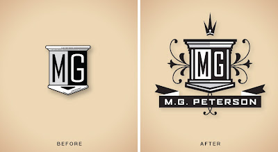
M.G. Peterson Logo Design Update
Sometimes clients just need a bit of an update to modernize the logo design they already have. We brought a bit more structure and embellishment to this CPA's old logo, done quite some time ago. We also developed a less ornate version of the logo to appear in smaller applications such as on business cards. (Click image for detail)


Friday, August 28, 2009
Effectiveness vs. Accuracy
Unisg the icndeblire pweor of the hmuan mnid, aocdcrnig to rseecrah at Cmabrigde Uinervtisy, it dseno't mttaer in waht oderr the lterets in a wrod are, the olny irpoamtnt tihng is taht the frsit and lsat ltteer be in the rhgit pclae. The rset can be a taotl mses and you can sitll raed it whoutit a pboerlm. Tihs is bucseae the huamn mnid deos not raed ervey ltteer by istlef, but the wrod as a wlohe. Aaznmig, huh?
Wednesday, August 26, 2009
Musician's Website Logo Design
Recently, I collaborated with Vianet Internet Services to resurrect a website identity that they had placed on their 'back burner'... MusicianAudition.com. The site connects musicians looking to collaborate, join bands, get gigs, etc. The first step in any well branded website design is a carefully crafted conceptual logo, right?, so... we began there. They had a pretty solid sketch of what they had in mind. I ended up designing a few versions for consideration, pulled it all together and polished it off for implimentation. (Design: Vianet, Paul Howalt)


Tuesday, August 25, 2009
Rainforest Stationery Design
Rarely do we come across a client with such a tenaciously vigilant marketing drive! Ike Tippetts of Rainforest Plumbing and Air came to us with project after project where his street team was passing materials out sooner than the ink could dry on the sheets. His inititiative is inspiration to us all. We've also never run across a client that has wanted to be more playful with his identity. We've been pleasantly surprised with the creative latitude we are given with his materials... to the point of sometimes needing to encourage a little more structure and less whimsy just so we don't end up tearing down the solid credibility that he has built over the years. We'd love more clients like Ike! Click on image for more detail (Design: Paul Howalt, Dena Soukieh)


Monday, August 24, 2009
Frost Orthododontics New Blog Website Design
Frost Orthodontics needed a blog site to keep patients and vendors more up to date with 'up to the minute' developments going on at their new office. It was designed around a Wordpress code skeleton, but is completely stripped and customized as far as the design implementation goes... It even contains an animated Flash header! We focused carefully on reflecting the look and feel of the office interior and new branding language that we developed for them a few months ago. Click Image for more detail (Design: Paul Howalt)


Thursday, July 9, 2009
BizBuilder Logo Design
Gibson, Ferrin & Riggs Law Office offers it's business clients a new service called BizBuilder. They unencumber and protect their clients by taking on necessary preventative and emergency legal work such as corporate compliance, human resource issues, license & copyright filing, retirement planning, etc. This logo was crafted to appeal to owners who need to focus on building their businesses with what they do best and don't want to get wrapped up in laborious legal work or potential lawsuits along the way. Logo Design: Paul Howalt

BRANDING, IDENTITY DESIGN, LOGO DESIGN, ICON DESIGN, STATIONERY, PACKAGING, BROCHURE DESIGN, MARKETING PROMOTIONS, WEBSITE DESIGN, SIGNAGE, GRAPHIC DESIGN ARIZONA

BRANDING, IDENTITY DESIGN, LOGO DESIGN, ICON DESIGN, STATIONERY, PACKAGING, BROCHURE DESIGN, MARKETING PROMOTIONS, WEBSITE DESIGN, SIGNAGE, GRAPHIC DESIGN ARIZONA
Wednesday, July 8, 2009
BiziBoom Logo Design
Our law client Gibson, Ferrin & Riggs needed a logo for a new service offering that trains business owners how to make their practice billings grow exponentially in a short amount of time. They call the program BiziBoom. Here is the logo design that we just finished for them. Design: Paul Howalt


BRANDING, IDENTITY DESIGN, LOGO DESIGN, ICON DESIGN, STATIONERY, PACKAGING, BROCHURE DESIGN, MARKETING PROMOTIONS, WEBSITE DESIGN, SIGNAGE, GRAPHIC DESIGN ARIZONA
Monday, July 6, 2009
The Font Conference Video
We came across this little gem of a video on CollegeHumor.com. We, as graphic designers, "spec out" fonts every day for a living... It's fun watching the drama as CollegeHumor puts human personalities to some of the most common fonts we have to deal with. This is a must see! (Click Image for Video)

Thursday, July 2, 2009
CPES Homestead Program Brochure Design
CPES (Community Provider of Enrichment Services), located in Tempe, AZ commissioned us to design a brochure for the latest venture, "The Homestead Program". It is a multi-bed facility in which troubled teens with severe behavioral disorders and/or substance abuse can be assessed by qualified health specialists and treated with lifestyle modification plans in order to reintegrate them back into their famiy environments. It is literally a last ditch effort before they are turned over to either the Juvenile Justice System or placed in a secure log-term hospital facility. This brochure needed to reflect the direness of the patients' situation, but also exude a sense of hope and warmth. Click image for more detail. (Design: Paul Howalt)

RealRentals.com Website
After designing a logo for RealRentals.com, we set our minds to fleshing out the look and feel of their website. The demographic they are going after is young college age renters, so the site had to be geared to fit that world. It also had to be a 'graphic universe' that the new logo could comfortably feel at home in. This is what we came up with. Click image for more detail. (Design: Paul Howalt)

Tuesday, June 30, 2009
Tactix Promotional T-Shirt 2009
We are selling these t-shirts below while they last for $18 USD (plus $4 for shipping). They come in sizes L, XL, and XXL (all sizes are 'classic' fit/not 'athletic' fit). Originally these were produced for a golf tournament promotion, but we printed some extra to sell right here as a TactixBuzz blog exclusive if you missed out. We have a few left, and now ONE CAN BE YOURS! Give Robin a call to process your credit card order (480) 688-8881 - or pay via PayPal online. Send checks and money orders to Tactix Creative, Inc., 4838 E. Baseline Rd. Suite #120, Mesa, AZ 85206 USA, Click Image for detail. (Design: Paul Howalt)


Friday, June 26, 2009
The Vendor / Client Relationship
Um, this video clip hits almost too close to home... I could barely bring myself to post it. Creatives, try your best not to cry... We hear this stuff every day! (video: Scofield Editorial, Inc.)

Thursday, June 25, 2009
Dena's New Baby Arrives!
OK - So around here, there are holidays and special occasions, but none, however are more revered and honored as iPhone Day! It could be a consequence of being immersed in Apple products all day long (being graphic designers); or it could be because the iPhone 3GS is the absolute coolest techno toy that any working individual can hold in his or her hand! - or, it could be a little of both. Anyways, after the preorder and long wait, Dena received a 'very special' delivery from the UPS guy this morning... and there was much rejoicing! (Click Image for Unpacking Sequence).


Vianet Real Estate Rental Website Identities
When it comes to running online companies, Scottsdale's Vianet Internet Services has it figured out! They cross market and 'spiderweb' across multiple sites in order to promote themselves organically instead of having to pay for expensive Google Adword campaigns. They came to Tactix Creative to create identities for a couple new complimenting sites they've launched to service those looking for real estate to rent nationwide. The first, HouseForRent.us is a more traditional and targetted toward customers approximately age 35-65; the second entity, RealRentals.com is meant to speak to renters 18-35, and therefore has a more playful and illustrative typography / mark. Vianet continues to be a great client in that they always push us to do what we love to do... It's so refreshing! Logo Design: Paul Howalt


Greenhaven Community Identity
National apartment community developer, Fore Property, has called upon Tactix Creative to craft identities for many of their latest residential projects. This particular one, Greenhaven, is located in McKinney, Texas; a city with a mission to leave one of the lightest 'carbon footprints' on our nation. This new complex is fully LEED Certified and fits in perfectly with the city's culture and mission. Our job was to create a visual language to reflect their dedication to environmental responsibility and lifestyle. We also specified recycled paper stock and soy based inks to be used to make all collateral materials more landfill friendly. It has been refreshing to work for a corporation that revolves around "going green" instead of just giving it a fashionable nod and buying a few CFL bulbs for their lobbies. (Click on Images For Detail) Logo and Signage Design: Paul Howalt / Brochure Design: Dena Soukieh

COMMUNITY LOGO

COMMUNITY BROCHURE

MARQUIS SIGNAGE
Friday, March 6, 2009
Tyrell Beavers Dentistry
We designed this logo and stationery set for a local dentist. After doing so many dental identities, it's hard to come up with fresh new ways to express the essence of the profession and the client's way of doing business. For the logo, we crafted a multidimensional modern rendering of a tooth using transparency and the client's established palette. The stationery picks up on the transparency and patterns were applied utilizing the dotted line motif potisioned in front of the logotype. (Click image for detail) Logo design: Paul Howalt, Stationery design: Dena Soukieh


Thursday, February 26, 2009
Pizza Hut Manhole Cover
Pizza Hut underwent an interior makeover recently and we were invited to submit our design propsal for consideration. Everything was approved and just before the changeover went into production, they switched to a different concept submitted by a competing firm... UGH! This whimsical manhole cover below (shaped like a Pepperoni Pizza) was the only piece of ours that survived the cut. In the end, however, it was not applied to floors, but to the front surface of the retail counters... HUH?


Target Embark Luggage Icons
I received a call yesterday from a friend of mine, Sherwin Schwartzrock (www.Schwartzrock.com) - a stellar designer operating out of Minnetonka, MN. He was in a timing bind and needed help on a project for an in-house brand of Target Stores. Sherwin had already established a visual look and feel for exploration, but needed additional icons designed to complete the system. Well, I was honored to be a part of the process on the project. The icons you see below are what I submitted to him just in the nick of time for presentation - Whew! (Click image for detail) Design: Paul Howalt


Tuesday, February 24, 2009
Kono Magazine Illustrations
Last year, I was commissioned to render a handful of full page endangered animal illustrations for KONO Magazine. Kono is a monthly publication run out of Scottsdale, Arizona and geared toward kids who are involved with martial arts. Here are a few samples of some of the work I've done over the past year for them. (Click on images for more detail) Illustration: Paul Howalt


Monday, February 23, 2009
Crimshield
You're looking at the stationery kit we designed for one of our favorite clients, Crimshield. They provide the most thorough background checks in the industry. The Crimshield team provides more than just a quick database search of public criminal record. They check aliases, close spellings and up to the minute arrest records. Nothing slips by these guys... Nothing! If you need peace of mind when hiring a new employee or even meeting a potential boyfriend, Crimshield is the company to contact. (Click image for detail) Design (logo+stationery): Paul Howalt


Subscribe to:
Posts (Atom)



 Posts


