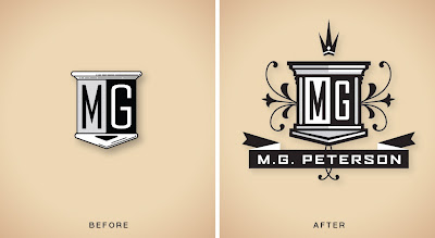
Sometimes clients just need a bit of an update to modernize the logo design they already have. We brought a bit more structure and embellishment to this CPA's old logo, done quite some time ago. We also developed a less ornate version of the logo to appear in smaller applications such as on business cards. (Click image for detail)
Wednesday, September 23, 2009
Subscribe to:
Post Comments (Atom)


Hey - I used to live around the corner from MG and we went to the same church together. I didn't realize he had such great taste.
ReplyDeleteI think you need to help him with his website, though :)
I didn't realize he had such great taste.
ReplyDeleteSome fascinating blog post you have shared here. I am glad to visit this informative blog. Thanks for everything.
ReplyDelete